
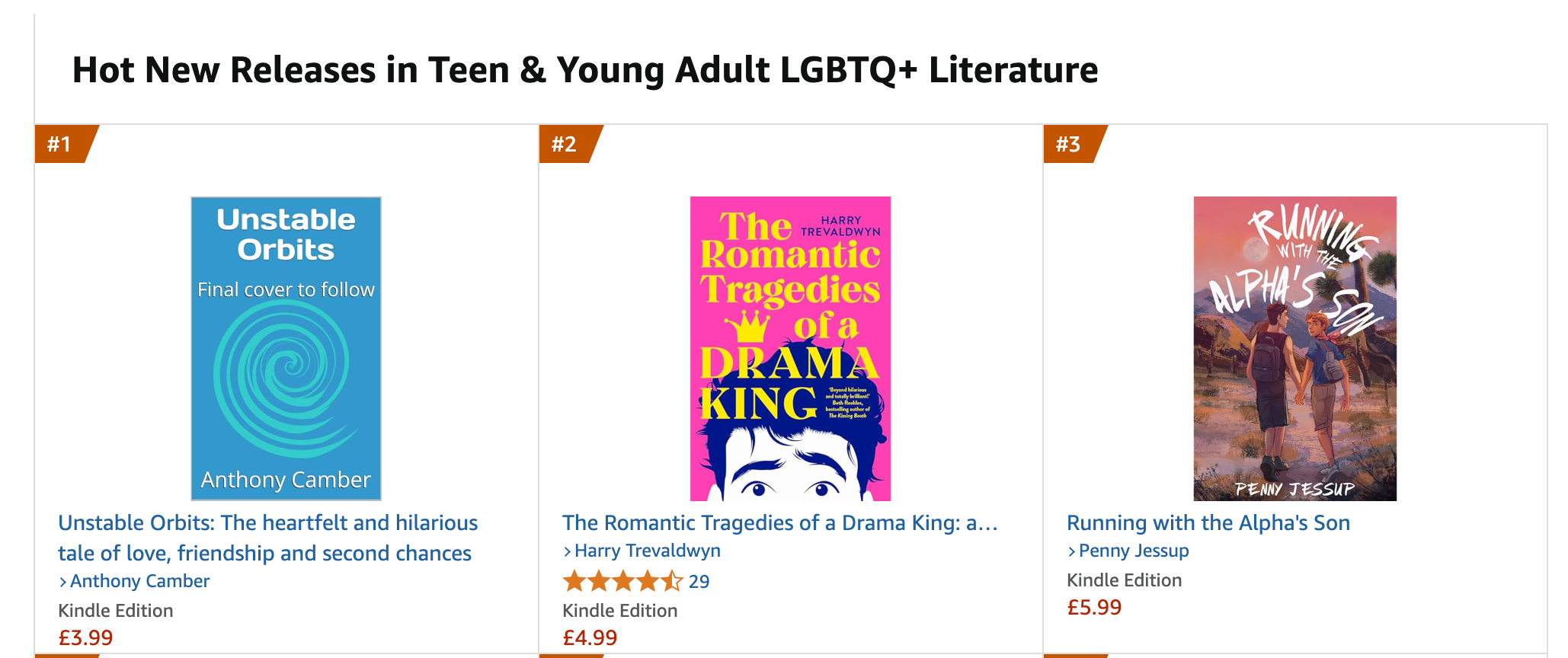
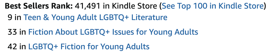
Unstable Orbits preorders started with a bang: for a while the book was top of the Hot New Releases list in Teen & Young Adult LGBTQ+ Literature, and reached #9 in the bestseller list for Teen & Young Adult LGBTQ+ Literature (these are for Amazon UK). But preorders have dropped off now — not too surprising. I’m hoping they’ll spike again once the book has a cover.
Covers are tricky. You have to meet current genre expectations and represent the story in some way. Unstable Orbits is a YA coming-of-age comedy drama, and the trends here suggest:
- An illustrated cover with clean lines and flat colours
- Bold, sans serif typography integrated with the artwork
- A central, symbolic image encapsulating the themes of the book
- A vibrant, contrasting colour palette
The cover needs to show that it’s a humorous book with serious themes.
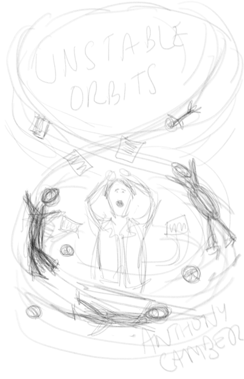
My cover ideas
I’m working with my designer now, and thought I’d show some preliminary pencil sketches. These are all mine, with no artistic merit:

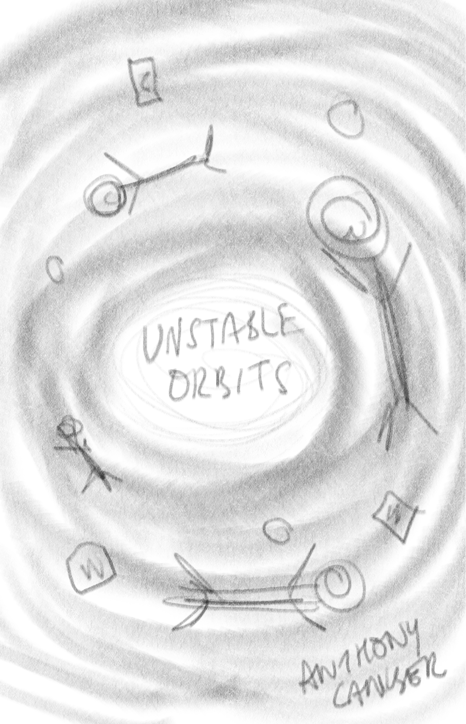
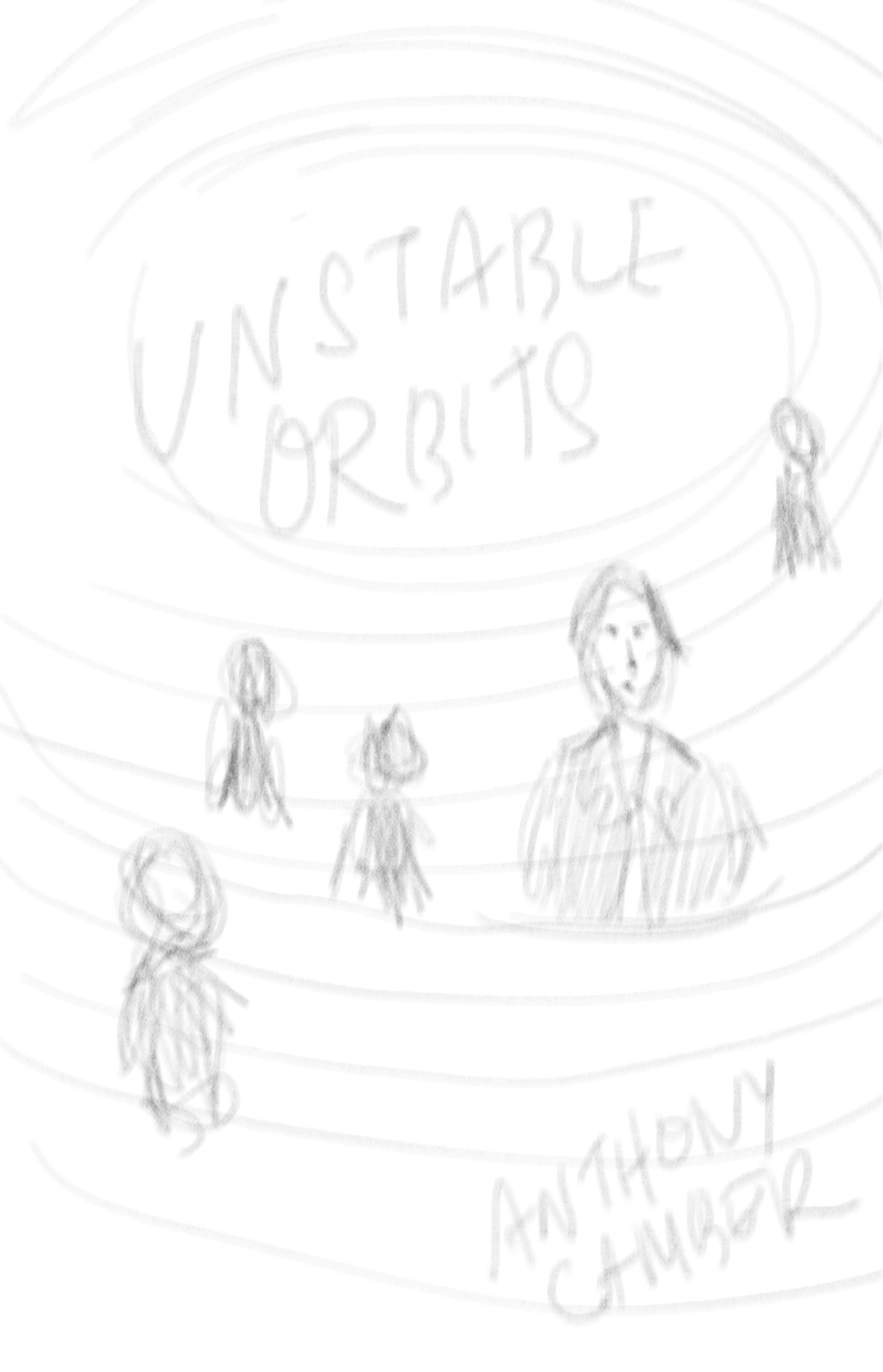
Each of them uses orbiting as the dominant concept, with the main characters of the book caught in the gravity. I think we’ll be able to show the book’s humour with any of these, in refined form.
Which do you prefer? Tell me in the comments!
And we might end up using something completely different.
Meanwhile my designer has been working on character sketches — I don’t want to show you these yet, but it’s fantastic to see Nate, Luke and Preston coming to life!
You can help make Unstable Orbits a success: preorder, follow me on social media, and promote my books to your friends and family. The more preorders I get, the more Amazon will take the book seriously. Thanks!


Leave a comment