
For the launch of A Room Full of Elephants I’ve been considering running a short Facebook ad campaign: a couple of days before and after the release date, to drum up some eyeballs.
The release date is next Wednesday. Yesterday, I thought it was about time I made the ad. I should have started sooner, but, you know, I’ve had a book to finish. Priorities!
Facebook’s ad guidelines helpfully supplied image dimensions: 1200 x 628 pixels. They also stated “Your image may not include more than 20% text,” to stop people using text-filled spam ads. Reasonable, I suppose. I didn’t follow the link to “see how much text is on your image” because I didn’t have an image yet. 20% is 20%, I thought to myself, I’ll make something that doesn’t exceed that limit. I’ve been counting pixels since before Zuckerberg was born, you know. I can draw bounding boxes. I can multiply*. I can divide*.
(* I can tell machines to multiply and divide.)
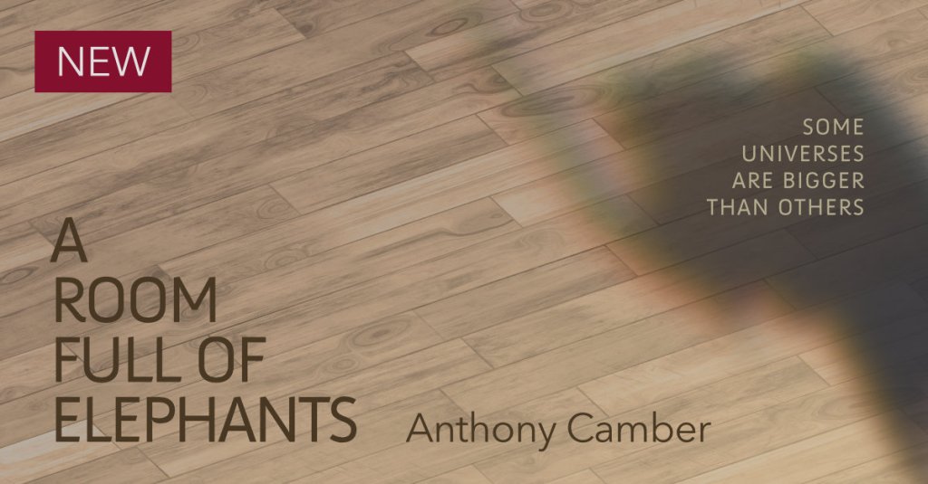
I created an image: not the best ad in the world, but it matched the graphics I’ve been using elsewhere, based on the book cover, and it followed the 20% rule. Here it is, for posterity:
Then it was time to double-check using that “see how much text is on your image” link, and…
Oh.
In their tool, you don’t draw bounding boxes for your text. The image is divided into a grid, and you click to colour in each grid rectangle, each cell, in your image that contains text. If you colour in more than 20% of cells, you have too much text. It’s not as accurate as drawing a bounding box, but it’s a much simpler user interface (both to use and to write).
The accuracy of the grid method depends entirely on the size of each cell. Imagine each cell was a single pixel: here, you’d colour in all the pixels enclosed by your hypothetical bounding box, and the answer would be the same. The coarser the grid, the less accurate the answer: imagine a two-by-two grid, where each cell corresponds to a quarter of the image. One piece of text in a single rectangle, and the system would think your image was 25% text.
Would you like to know the size of Facebook’s grid? 20×20? 10×10?
It’s 5×5.
Five by five.
Have it in roman numerals too: V by V. There are only XXV cells, and I’m only allowed to colour in up to V, because V / XXV = XX%. (I’ll stop this now, it’s confusing me.)
Here’s what my ad looks like, with the cells coloured in strictly according to the rules:
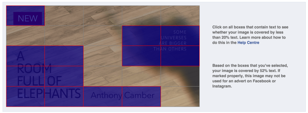
Facebook thinks my ad contains 52% text. Not something I imagine any reasonable punter would guess, and out by a factor of three or so.
How do I fix this? Oh, that’s easy: move text so it overlaps fewer gridlines. Shrink text to fit. Or to put it another way: change my design. Make my ad look worse. (For big brands, this can mean: break your branding rules. Good luck, ad agencies, explaining to your client why Facebook won’t accept your ad. That’s assuming pros have the same term as the rest of us, by no means certain.)
The true question, though, is: does Facebook use this same 5×5 grid when approving ads, or is it just a handy tool for ad creators to see if they’ve gone massively over the top?
In other words, what’s the real rule: “Your image may not include more than 20% text”, or “Your image may not include text in more than five cells when divided into a 5×5 grid”
And the answer is: who knows? Facebook, you would hope, but the evidence suggests they’re not sure either. I’ve seen reports of ads being rejected for failing the grid, and then reinstated on appeal. More than one of those ad-yourself-to-success listicles recommends obeying the grid rule. My guess is there’s a front line of grunts who apply the grid rule mechanically, and a second line who deal with the complaints and spend most of their time eye-rolling.
As to whether any of this truly matters: yes, I think so, at least in part. Such a coarse grid encourages you to use short, shouty text to make “best use” of your five cells, or to cram text together, breaching design principles. The ads are worse as a result: bad for the advertiser, bad for the consumer, bad for Facebook.
This rule also makes it very hard to include important text such as disclaimers required by law. Not an issue with A Room Full of Elephants, admittedly, assuming we don’t get Trumped.
Anyway: I’m not placing this ad right now. I’ll think of another approach. I’m allowed to include an image of the product I’m selling, and text on the product doesn’t count towards the 20% (unless you zoom in to try to cheat the rules, and the extent of the allowable zoom is, of course, subjective). So I’ll do a photo of the book in a relevant setting, and I have an idea. All I need is a copy of the paperback: and for that, I’m still waiting.
Thanks, Facebook.


Leave a comment